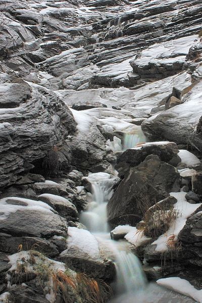
water on the rocks
† 22-03-2008 † 9539 views
Visitor's Comments
- Olivier (Homepage) wrote: Belle matière ... on aimerait voire la photo en grand !
- Oswegan (Homepage) wrote: For me, I like it because it seems black and white but for the small amount of color in the foreground. The lines are nice too. I wish your site could remember my info, if this is pixelpost, send me an email and I will send you the code.
- Michael Skorulski (Homepage) wrote: This is a stunning image in composition and excellent detail. Just wonderful.


Add Your Comment