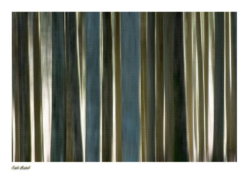
bar code
† 16-11-2008 † 6660 views
Visitor's Comments
- Katrin (Homepage) wrote: Cool shot! But what is it? Looks like some kind of fabric?!
- Cerstin (Homepage) wrote: A wonderful idea and a great "painting" (would be fantastic in very very big on the wall).
- chiara (Homepage) wrote: I love the tones and the canvas effect.
- martineb (Homepage) wrote: Excellent idea!! very beautiful effect!! I like it a lot!
- Simone (Homepage) wrote: Non amo molto le elaborazioni profonde ma, inutile dire che nel caso dei tuoi lavori denotano creatività...una visita al tuo photoblog è sempre un piacere.
- John Maslowski (Homepage) wrote: Interesting composition, like the vertical lines and tones. The lighting really enhances the effect on this image, great job.
- cako (Homepage) wrote: Interesting patterns and a perfect title.
- LGB (Homepage) wrote: What a nice composition. Great picture!
- Siam (Homepage) wrote: amazing but so much imagine
- Bernhard (Homepage) wrote: Wow, great abstract shot. i like it. What was that?
- AC (Homepage) wrote: Very creative snap. Nicely seen and well executed.
- Miro at LightIsAllAround.com (Homepage) wrote: I like colors and geometrical rhythm, you mine quite big impact from minimalistic theme
- Marcie (Homepage) wrote: WOW! Absolutely stunning abstract. WOW!
- Ilger.nl (Homepage) wrote: Very artistic. Looks painted.
- Marie (Homepage) wrote: excellent rendu ! j'aime beaucoup !
- Laurie (Homepage) wrote: Wow I love the colors, textures, and patterns here.
- Florence (Homepage) wrote: Don't know what it is but it's a great abstract with lovely muted tones !
- Beat (Homepage) wrote: very interesting . Is (was) this a curtain?
- beanow (Homepage) wrote: The beautiful, elegant and interesting image!
- grant (Homepage) wrote: very interesting photo, great light.
- Tom (Homepage) wrote: Cool abstract shot with a lovely range of colours.
- 613photo (Homepage) wrote: Hey, Paolo. Great shot. It reminds me of my "Metal Abstract", but honestly I like yours better. Great work.
- sherri (Homepage) wrote: Ah, yes, I can see that...neat capture.
- jo (Homepage) wrote: The canvas texture really threw me, seems like a painting, with brushstrokes even. Subtle and scrummy!
- Zing (Homepage) wrote: Nice patterns, colours and light.
- Elaine- (Homepage) wrote: very pleasing colors, i would like to have curtains like that, not to assume that they are curtains, but i would like to
- Nacho Carrears (Homepage) wrote: Preciosos colores y texturas Saludos.
- Denis (Homepage) wrote: Fina abstract. A curtain ?
- Dhini (Homepage) wrote: That is nice bar code colour
- Andy (Homepage) wrote: Nice lines in this. A cool pattern.
- JJ (Homepage) wrote: interesting abstract, wonderful lines colors and textures, is it a curtain


Add Your Comment