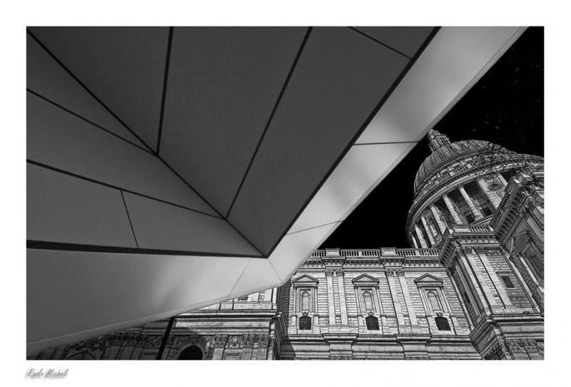
St Pauls Cathedral
† 26-12-2008 † 11360 views
Visitor's Comments
- Olaf (Homepage) wrote: An amazing composition, perfect made in HDR. An happy new year and have always the perfect light in 2009.
- Tom (Homepage) wrote: Nice angle. Great picture.
- Denis (Homepage) wrote: Excellent contrast of styles, excellent perspective. I love this image
- Gromitch (Homepage) wrote: Composition is stunning!! Amazing contrast between surfaces! I want to take my old 17-40 lens and go to the city :))))
- krusaf (Homepage) wrote: Excellent composition and treatment
- pedro (Homepage) wrote: Excellent composition, Paolo, plenty of contrasts. A happy new year.
- beanow (Homepage) wrote: Worked wonderfully B & W! He looks how graphic artist...Bravo!
- cako (Homepage) wrote: Great composition and interesting contrasts of old and modern architecture.
- yiannis krikis (Homepage) wrote: very nice framing and great image quality
- grant (Homepage) wrote: amazing composition and detail!
- Arjan - PlasticDaisy (Homepage) wrote: Impressive image! I love the original way of presenting this! This is in London right? I'll be going there for the first time next week so I hope to catch some images like these :)
- oldshutterhand (Homepage) wrote: Great composition.
- krims@nline.be (Homepage) wrote: Love the contrast between the modern stuff and the old cathedral in the background, the monotones add something special to this picture. Well done!
- Beat (Homepage) wrote: Ciao Paolo, I'm back :-) You have "The Photograic Eye"! Great picture!
- aadesanya (Homepage) wrote: Very interesting... I'm not sure what that is to the left of the image, but it adds an interesting dimension to this image. Regards Ade
- Andrew (Homepage) wrote: Framed with graphic precision. Excellent.
- mbecher (Homepage) wrote: Is this real? If so, great perspective. Very esher-like.
- Elaine- (Homepage) wrote: wow, just gorgeous!! it reminds me of Escher!!
- Andres (Homepage) wrote: Amazing combination, angle and tones!!
- Craig (Homepage) wrote: You always find a new slant on everything! I agree with the other comment that this has a pencil drawn feel to it, very nicely done!
- Claus Petersen (Homepage) wrote: Looks allot like a combination of a drawing and a photograph!
- 613photo (Homepage) wrote: I like this. As mentioned, the juxtaposition between new and old is great. It also looks like a pencil drawing but definitely not the fake photoshop-generated kind. Looks a lot like the US Capitol Building.
- Michael Rawluk (Homepage) wrote: That is a very fresh view of the dome and I love the processing. I hope you had a wonderful Christmas.
- Polydactyle (Homepage) wrote: Great architectural view. I like the difference between old and modern.
- Tom (Homepage) wrote: Interesting photo - great detail.
- Laurie (Homepage) wrote: Excellent lines here. Great shot!


Add Your Comment